Why I Think this Image Fails, and How I Would Fix it.

2 Comments

Why I Think this Image Fails, and How I Would Fix it.

Why this Image Fails, and How I Would Fix it. 


I spent 3 months completing a full 3D environment piece, and I'm utterly unhappy with the final results

I want to start by saying: I'm not writing this to get a bunch of “oh man, don't worry it looks fine!” comments. I'm not looking for validation. It's my opinion that the ability to self-critique is the main quality aspiring and junior artists are lacking. This is an attempt to practice what I preach; to point out where I think this piece is lacking, how to make it better, as well as celebrate what went well.  

And honestly, I needed some way to actually get some use out of this "waste of time"...


How did this happen?

Looking back, it's not hard to see how this got away from me. It came down to 2 main things: 

1) I needed a 'horror' image for a friend's project I was helping with:

  • To be clear, I was honored to be ask to help with this awesome project.  The failing 100% comes down to how I personally approached it. That said, usually when I do "personal work" at home, I don't have any restrictions. They are always passion projects. Because this was part of a larger project, it had some restrictions (though they were admittedly loose). However, it was enough to make it feel more like work than a passion project.

2) I didn't have enough time to hit the hard deadline:

  • Almost every other aspect I talk about comes back to this point. 
  • It might seem like 3 months is a lot of time, but when you work full-time and try and keep some semblance of a life (I know, 'insert joke here'), 3 months really isn't that many total hours.
  • I had to work fast and efficient, to the point where I was cutting too many corners and not spending the proper amount of time iterating on the fundamentals.  


OKAY, So Whats Wrong With it?


The Composition SUCKS:

  • I did NOT spend enough time figuring out my composition for this piece.  I normally spend days, even weeks noodling the composition in block-out before I start. To me it's the single most important aspect to successful image (obviously).  I didn't do that this time, and I paid for it.  The end result is confusing, busy, and unclear. I spent the better part of 3 months fighting against the composition at almost every step of the process. 

This was the only comp I did before totally diving in:, it was just one quick test. I usually make a handful of different compositions, then pick one, then iterate more on that before I move forward.  

NOTE:  The piece is flipped horizontal in the final image. The composition was SO far off, that it looked slightly better when it was flipped. This caused all sorts of issues during the creation of the image. The final render was flipped, not the full 3D scene. 

Examples of just some of the early block-out compositions I did for a previous (arguably more successful) image.  You can even see me talking about my process on my Gnomon Workshop (shameless plug)

Some thoughts on how I would improve this composition:

A. (red) : The flesh and stairs on the right are the main focus. This is because its the area of highest contrast. Not a bad thing on its own, but the image doesn't really offer the viewers eye to lead anywhere meaningful after seeing this. 

B. (Green): Well except one place, the far left wall and ground...where nothing is. Because of the way I set up that light on the stairs, it ended up blasting light on the far wall. This was something I was constantly struggling with the whole time as I felt it was NOT important to the image, but demanded attention. 

C. (Yellow): In an attempt to add some more contrast to the image, and lead the eye back into the image, I added more detail (another stair way) and a slight rim light on the subway train. Again , the issue being, there really was nothing to look at back there. 

D. (Purple) : A bit of a wasted element was the natural swoops I got from the ceiling. If I had spent more time figuring out this composition, these could have played a key role in leading the viewers eye. As it stands, they are kinda just there, maybe pointing at the already contrasted stairs and flesh.

A. (Red) : The 'flesh' and stairs on the right are the main focus. This is because its the area of highest contrast. Not a bad thing on its own, but the image doesn't really offer the viewers eye to lead anywhere meaningful after seeing this...

B. (Green): ...Well except one place, the far left wall and ground... where there is nothing of interest. Because of the way I set up that light on the stairs, it ended up blasting light on this far wall. This was something I was constantly struggling with the whole time. I felt it was NOT important to the image, but it still was demanding attention. 

C. (Yellow): In an attempt to add some more contrast to the image, and lead the eye to the background, I added more detail (another stairway) and a slight rim light on the subway train. Again, the issue being, there really was nothing interesting to look at back there. 

D. (Purple) : A bit of a wasted element was the natural swoops I got from the ceiling. If I had spent more time figuring out this composition, these could have played a key role in leading the viewers eye. As it stands, they are kinda just there, maybe pointing at the already contrasted stairs and flesh. 


Horror Theme was executed poorly:

  • This was supposed to be a horror inspired image. Honestly, horror is not normally my jam and unfortunately, I didn't take the time to understand what a 'horror' image should really be and what it really meant. I just jumped right in, and because of this, I ended up with an image without enough atmosphere or intrigue to sell 'horror'.  It turned out generally... boring.

For example: I decided to blast the ONE 'horror' element (the flesh) with light. This instantly removed any sense of suspense or mystery (Thanks to Geoffrey Ernault for this feedback early on. Unfortunately, I didn't take the time to adjust it then.) 

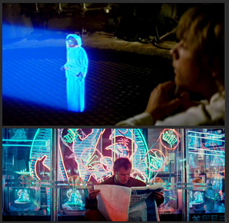
1979's Alien is the classic example of "it's scarier if the audience can't see it"

The movie loses a bit of its edge once you see the Alien.  "HUG ME!!!" 


    Muddy image quality:

    • Overall the image turned out muddy as shit. This came down to two things I think: my beauty lighting and my texturing. 

    Notice the amount of texturing in the 1st image vs. the 2nd. The 2nd image has much more texturing done in 3D as well as more work on the materials. Because of the deadline, I didn't have the time to texture everything in 3D and I had to rely heavily on a 2.5D approach using Photoshop. Many of the textures were overlayed and multiplied on the final render, which resulted in a lack of subtlety in the textures and materials. I believe this added to an overall muddy feel.  

    This is a beauty lighting render straight out of V-Ray: Because the base lighting wasn't fully fleshed out, I again relied heavily on compositing the lighting layers in Photoshop. This resulted in most of the subtlety in the lighting being lost. (Though, notice the image above is much less muddy. This is because the materials and lights were doing the heavy lifting before it got "overly Photoshoped".)

    WHAT THE FUCK... I RIPPED OFF GHOSTBUSTERS II ?!:

    • I shit you not, this was not on purpose. A lot of my art is homage, so it would make sense for me to homage Ghostbusters II, but apparently I did it fully subconsciously. Toward the very end of wrapping this up, I was getting a critique from my friend Theo Aretos.  I pulled up some Ghostbuster images on google to explain a point I was making, and that's when this image came up:

    W.T.F. pink slime... in the EXACT subway I had just created....

    If I hadn't been almost done with the image, I would have just stopped at this point. It was a bizarre experience to find out I had unintentionally and subconsciously ripped off one of my favorite movies. If I was going to do it, I would have at least wanted to do it thoughtfully and carefully, not haphazardly and on accident. 

    The only thing I had time to do was to throw a quick 'easter egg' to Ghostbusters, in the hope that I at least wouldn't get called out for outright ripping the idea off. Sad. 


    Right, and What Went Well?


    I Tried many new techniques:

    • As with every project, I found ways to learn new things and try new workflows:

    Tiles:  ALL the tiles are geometry. Thouasnds of tiles. I experimented with using ZBrush (MatchMaker brush) and deformers in Maya to get the relatively complex curves and shapes to work. 

    Dat Flesh: Look-deving the flesh was way too fun. I used a few layered subsurface materials with custom masks to get this look. 

    Too bad I never really had the time to fully implement the final look. Once again, I relied too heavilly on overlaying photos. This was not my favorite reference to collect....


    The Water:

    Water: I could probably do a whole tutorial on just this, because I had to come up with a relatively fast way to make detailed water. I simulated some decent water meshes with NParticles, then placed them around in Maya, then used ZBrush to combine it into one large mesh. After that I painted/projected a texture for the foam. Then, using that texture, I used VRayScatter to populate millions of spheres to create the dirty foam. I think the process was solid, but (surprise!) I didn't have enough time to fully execute on it. 


    The Wrap up:

    In short, I would fix the image by removing the main creepy flesh from the foreground, and move it to the background , with less light on it. Maybe have it taking over the subway train... This would allow the water to be more of the interest for the foreground, but not be the main focus (the way the water flowed here could even lead the eye to the background of the image). And then this would allow the viewer to more naturally explore the image base on the lighting and subject matter. I would keep the lighting similar, but tone down the foreground lighting on the stairs, while increasing the rim light on the subway train and our new background creepy flesh. I would then spend much more time on textures, materials, and lighting. Lastly, I would add a few more 'easter eggs' from Ghostbusters, because well... damn.

    You might be thinking "Now you know what to do, why don't you just go back and fix it?!" It just comes down to passion, and use of my time (mostly poor use). Could I make this image better? Sure, but I would never love it. I would rather make something new... or let's be honest, play more video games. 

    -Devon

    2 Comments

    Comment

    Art book exploration: Part 01

    I know I'm not alone here. I have a decent amount of art books, and I RARELY go through them after I've bought them. It has felt more like a collection than a source of inspiration and creativity.  Some are still even wrapped! 

    That stops now. I will be going through at least one art book a week and posting some of my general thoughts about them, in hopes to inspire others to do the same. 

    I'm starting with my OG art book: SPECTRUM 7!

    The worn out cover (notice the label left on from the school libraery) 

    I first saw this as a freshman in high school. My friend Riley and I used to take turns checking this book out...we pretty much always had it. I've gone though this book so many times in the past, but it has been years now since I have opened it last. So much inspiration came from this book for me. At the time, it was one of the best and only ways to see concept art, fantasy, and sci-fi illustrations... and even early digital work. 

    One of us eventually stole it from my high school's library and I ended up with it.....sorry EHS! 


    A page I remember fondly 

    One of the coolest things I noticed while flipping through the book was the amount of artists I've met and worked with years later. 'Lil Devon never could believe that he would be able to meet and hang out with the likes of Syd Mead, Robh Ruppel , Phil Hale, or even work with the great Mr. Brian Horton.

    My past art director Brian Horton showing how its done back in the day.

    My favorite part of the prequels... when Obiwan and Mace fought through Naboo?!

    I remember this page... for some good reasons. 

    Phil Hale's work always stood out. 

    This image always stood out to me. Not even totally sure what is happening, or what the perspective even is... but the mood and tone always stuck with me. 

    That's it for this week.  I hope this will inspire some of you to open those art books, get inspired, and create some cool shit. 


    -Devon Fay

    Comment

    Middle Eastern Scifi Design Process:

    7 Comments

    Middle Eastern Scifi Design Process:

    Middle Eastern Scifi Design Process:


         I wanted to work on a new scene, but wasn't really sure on what exactly to make. I had a few ideas, but needed to solidify it into something I could start.  

         I had recently took a trip to Turkey with my wife and some friends.  I got really inspired by the Turkish architecture and always wanted to do something in that style. Also, as usual, I wanted to do another sci-fi scene, because currently that's still what inspires me. I’ve been on a cyberpunk kick lately, which was perfect, because I thought the two styles could mix really well.


           I decided to start by creating a bit of a mood piece. I took some more time to brainstorm and find some more reference, which helped me find some cool inspiration. I had also remembered seeing the practice of ISIS and others destroying ancient art and artifacts, which was pretty disturbing. I wanted to try and capture that a bit also. I decided I would make an ancient broken statue that had been repaired by cyberpunk technology. This seemed interesting and gave me a more solid direction to start from.


    Creating the statue:

         The statue reference I had showed lots of details in them, so I figured Zbrush was the best way to approach creating it. Zbrush would let me get lots of quick, clean details.

    After a quick blockout in Maya and some basic sculpting in Zbrush, I decided to try using some custom alphas for the detail on statue.

         When doing fairly complex things that are damaged, I try to do the clean version first, then add the damage and weathering after. Though it might take a little longer, I feel it's a more natural way to approach it and gives better results.


    Alphas:

         I took a screenshot from zbrush and started constructing the wing alpha.  It was important to keep each layer of feathers different in color, darker to lighter. This would pop some sections out more than others, giving it the proper layered look. I think of this like I am creating a displacement map, just one that Zbrush will give me more control over.

         I like to use the alphas as a mask, then I can use whichever brush (usually standard or clay) to add as much detail as I need, to the areas I want.

    The main 4 alphas I used for all the details for the sculpt.

    Sculpt:

         With the help of the ever-talented Joy Lea , the statue was posed with transpose and cleaned up. We tried to give the pose a more aggressive look, but looking back, I think we should have pushed it more, or gone with the more traditional stepping look.

        I also planarised the shapes a bit, so once I add damage and noise the details of the shape won't get lost.

         I then chopped ‘er up using a mix of curve slice, masking, and polygroups to get an interesting break in the statute. I also added some cuts and damage using the Orb crack brush.

         Last main step for sculpting was adding surface noise. I, again, use it by masking the noise, then adding the detail specifically where I want.

         The mesh was then cleaned up with zremesher, the details reprojected, and quick UVs added with UV Master. And of course  good ‘ol decimation with decimation master for use in Maya.

    Textures:

         Quixel’s DDO made short work of the texturing of the main statue. Just needed to provide an ID map and ambient occlusion map. DDO also now has an export preset for Vray, so that speeds up the process a TON.

    Modeling:

         I liked to add lived-in details when making something sci-fi . At it’s base, I know this scene is going to look sci-fi because it will have a hologram in it. So it's actually more important to find ways to make it feel believable. I added some technology details to the piece: wires, electrical boxes, and a projector. It helps give motivation to the hologram, but also shows the level of technology in this world. It’s high tech but low design.


    The hologram:


          The hologram was obviously a huge part of what will make this study feel sci-fi. I have always liked the look of the Star Wars holograms and it has become pretty ubiquitous with classic looking holograms. So I figured that was a good place to start. I also wanted to capture the feeling and look of Blade Runner. I figured I would try to pull in some of  the neon colors from Blade Runner to add to the style.

         I thought it would be a challenging to show the form of the hologram by just using the model and some opacity / edge / illumination shader tricks. I wanted it to be obviously a hologram, but also low tech. I decided to experiment with mixing in a “blueprint” style. I felt the clean outlines could help the overall read. I even considered adding in some of the numbers and dashed lines, but thought that might be too busy and ended up not necessary to sell the look.

         Once again, Joy Lea helped with the “blueprint” texture, while I was still figuring out some lighting. #dreamteam  

         It's hard to see in this shot, but I broke the blueprint drawing up in a few layers, then offset them a bit in Maya. This helped give it a bit more depth in the final image.


    On a side note, I was going to to try a few versions with a glowing wireframe look . But I felt this was a little too “on the nose” , so I decided against it. But it still might be something I look into in the future. 


         I also added some VHS style noise and distortion to the final look, again to help add to the 80’s grungy, sci-fi feeling.

         Here are a few color experiments. One the more classic Star Wars look, the other more colorful.

    Final image:

        I rendered out all the layers separate so I could keep as much control in Photoshop as possible. In Photoshop you can very quickly experiment with colors, glows, and overlays; this majorly speeds up the exportation process. And if you need another element, you have the scene setup in Maya, so just create the new element and import it in for your final comp.

         Lastly I added some stains, wear, and graffiti. Again trying to show its lived in and hints at what state society is at in this world. To be clear, I have NO CLUE what any of the graffiti says, so if they are offensive I apologize.

    Conclusion:

         For me, design has been the most challenging process when creating art the last few years. But it’s incredibly rewarding. It's where you can really make a statement, show the world you’re creating, and tell a story. I hope my process can help some of you in your future works. Just remember, by breaking the process down bit-by-bit and backing it up with reference, creating something awesome is totally in reach!

    7 Comments