
Middle Eastern Scifi Design Process:

I wanted to work on a new scene, but wasn't really sure on what exactly to make. I had a few ideas, but needed to solidify it into something I could start.
I had recently took a trip to Turkey with my wife and some friends. I got really inspired by the Turkish architecture and always wanted to do something in that style. Also, as usual, I wanted to do another sci-fi scene, because currently that's still what inspires me. I’ve been on a cyberpunk kick lately, which was perfect, because I thought the two styles could mix really well.

I decided to start by creating a bit of a mood piece. I took some more time to brainstorm and find some more reference, which helped me find some cool inspiration. I had also remembered seeing the practice of ISIS and others destroying ancient art and artifacts, which was pretty disturbing. I wanted to try and capture that a bit also. I decided I would make an ancient broken statue that had been repaired by cyberpunk technology. This seemed interesting and gave me a more solid direction to start from.

Creating the statue:
The statue reference I had showed lots of details in them, so I figured Zbrush was the best way to approach creating it. Zbrush would let me get lots of quick, clean details.
After a quick blockout in Maya and some basic sculpting in Zbrush, I decided to try using some custom alphas for the detail on statue.
When doing fairly complex things that are damaged, I try to do the clean version first, then add the damage and weathering after. Though it might take a little longer, I feel it's a more natural way to approach it and gives better results.


Alphas:
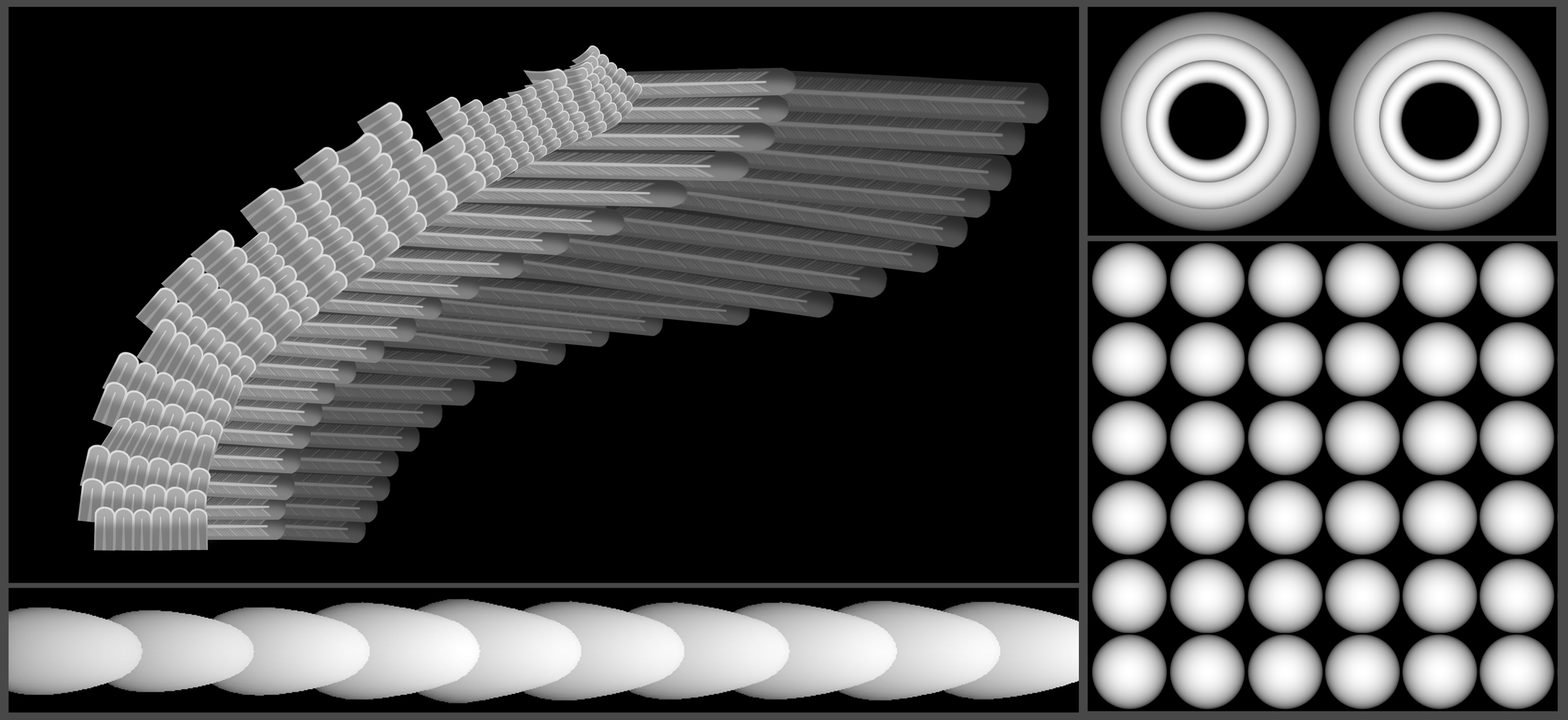
I took a screenshot from zbrush and started constructing the wing alpha. It was important to keep each layer of feathers different in color, darker to lighter. This would pop some sections out more than others, giving it the proper layered look. I think of this like I am creating a displacement map, just one that Zbrush will give me more control over.
I like to use the alphas as a mask, then I can use whichever brush (usually standard or clay) to add as much detail as I need, to the areas I want.
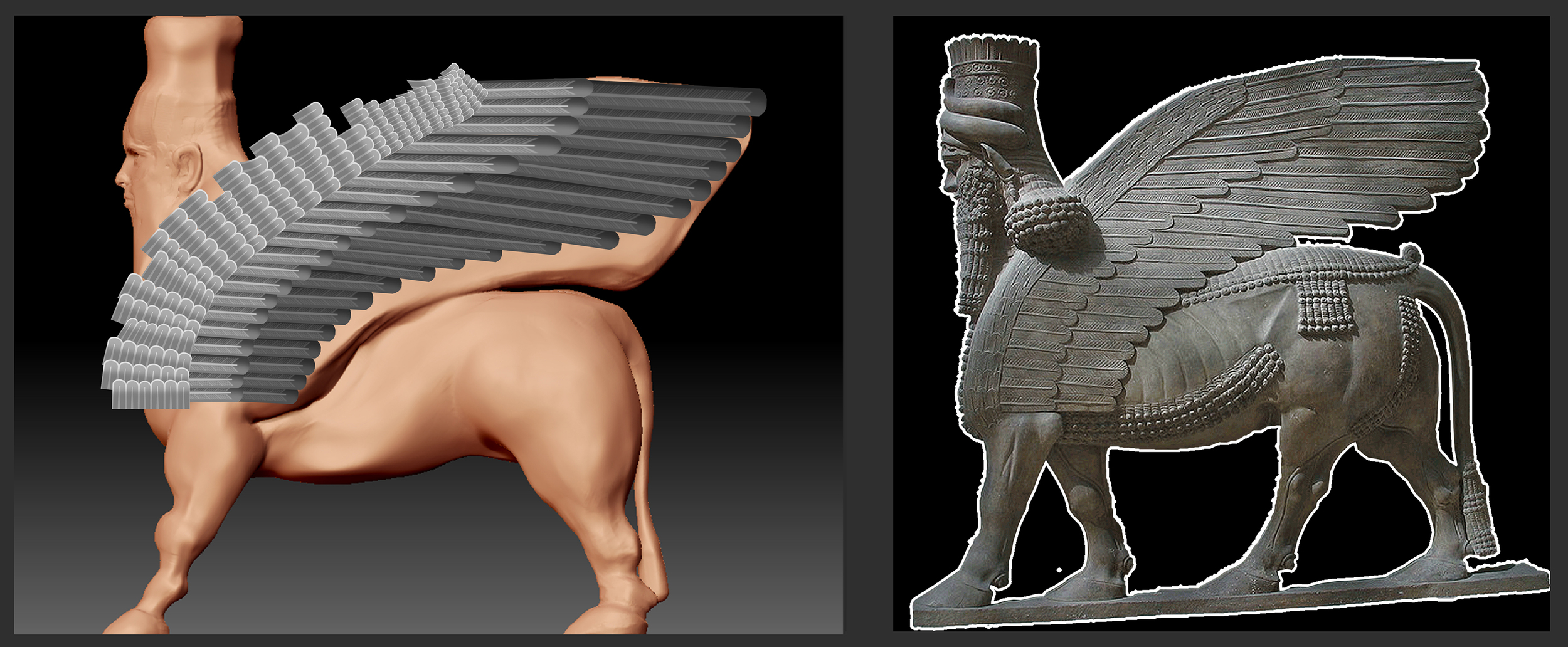
The main 4 alphas I used for all the details for the sculpt.
Sculpt:
With the help of the ever-talented Joy Lea , the statue was posed with transpose and cleaned up. We tried to give the pose a more aggressive look, but looking back, I think we should have pushed it more, or gone with the more traditional stepping look.
I also planarised the shapes a bit, so once I add damage and noise the details of the shape won't get lost.

I then chopped ‘er up using a mix of curve slice, masking, and polygroups to get an interesting break in the statute. I also added some cuts and damage using the Orb crack brush.
Last main step for sculpting was adding surface noise. I, again, use it by masking the noise, then adding the detail specifically where I want.
The mesh was then cleaned up with zremesher, the details reprojected, and quick UVs added with UV Master. And of course good ‘ol decimation with decimation master for use in Maya.

Textures:
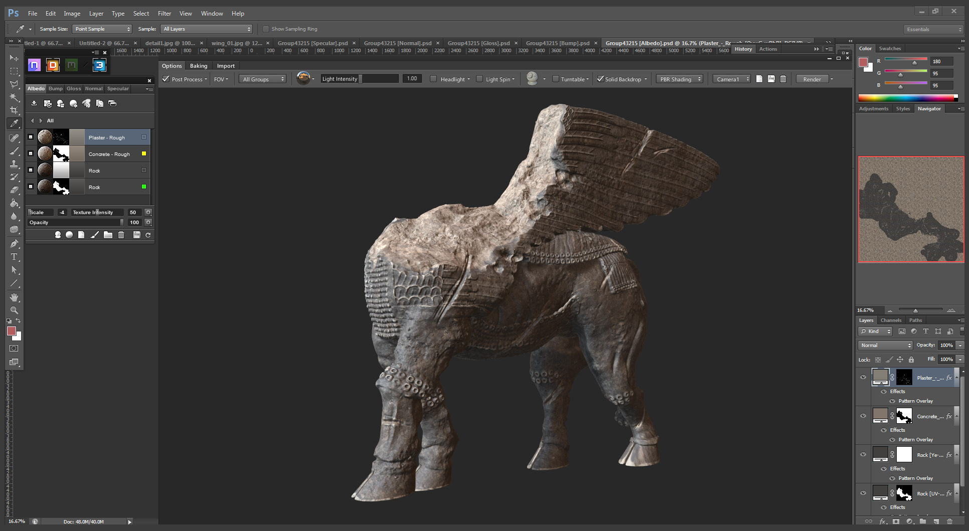
Quixel’s DDO made short work of the texturing of the main statue. Just needed to provide an ID map and ambient occlusion map. DDO also now has an export preset for Vray, so that speeds up the process a TON.
Modeling:
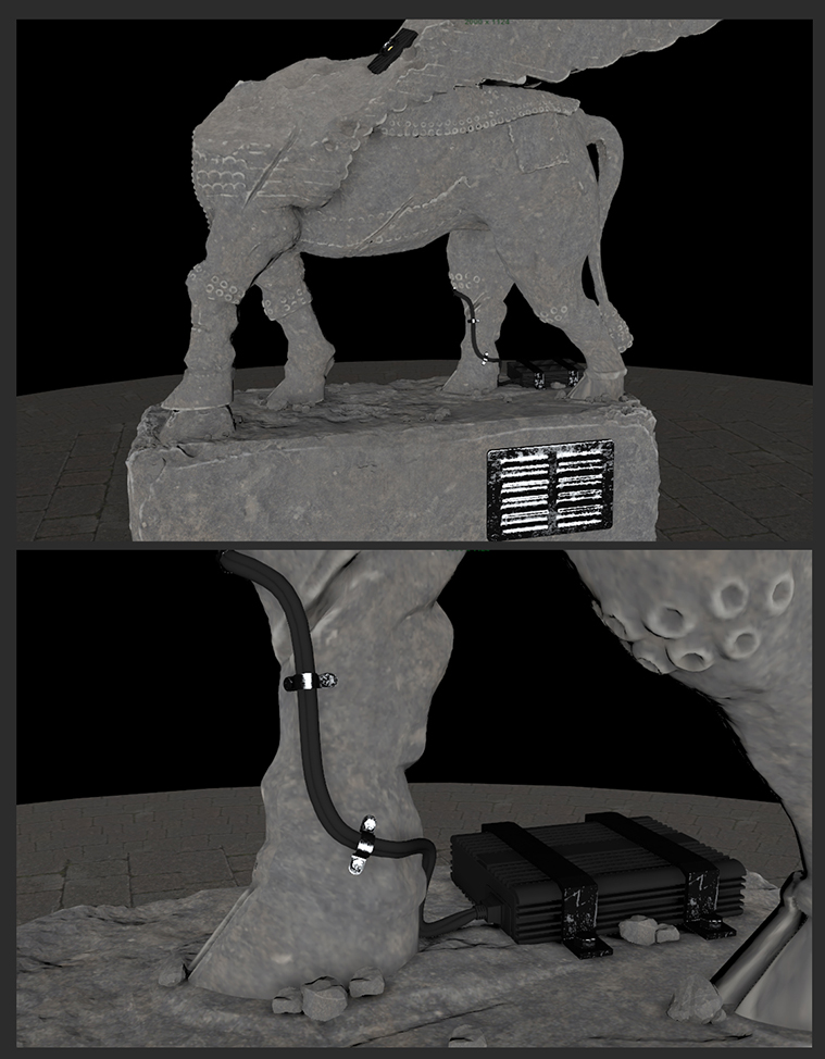
I liked to add lived-in details when making something sci-fi . At it’s base, I know this scene is going to look sci-fi because it will have a hologram in it. So it's actually more important to find ways to make it feel believable. I added some technology details to the piece: wires, electrical boxes, and a projector. It helps give motivation to the hologram, but also shows the level of technology in this world. It’s high tech but low design.
The hologram:
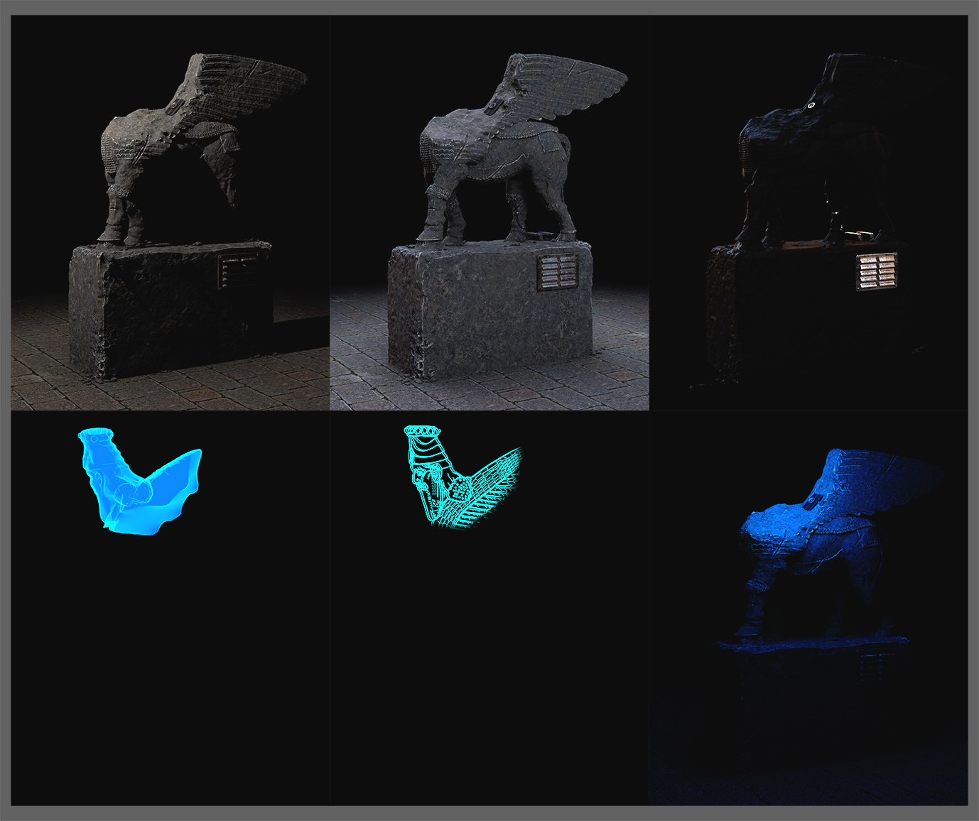
The hologram was obviously a huge part of what will make this study feel sci-fi. I have always liked the look of the Star Wars holograms and it has become pretty ubiquitous with classic looking holograms. So I figured that was a good place to start. I also wanted to capture the feeling and look of Blade Runner. I figured I would try to pull in some of the neon colors from Blade Runner to add to the style.
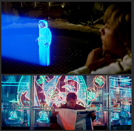
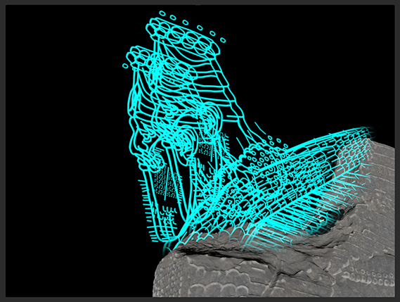
I thought it would be a challenging to show the form of the hologram by just using the model and some opacity / edge / illumination shader tricks. I wanted it to be obviously a hologram, but also low tech. I decided to experiment with mixing in a “blueprint” style. I felt the clean outlines could help the overall read. I even considered adding in some of the numbers and dashed lines, but thought that might be too busy and ended up not necessary to sell the look.

Once again, Joy Lea helped with the “blueprint” texture, while I was still figuring out some lighting. #dreamteam
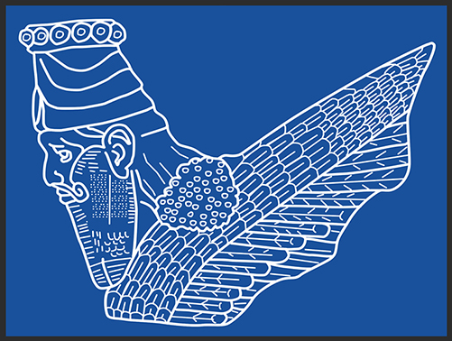
It's hard to see in this shot, but I broke the blueprint drawing up in a few layers, then offset them a bit in Maya. This helped give it a bit more depth in the final image.
On a side note, I was going to to try a few versions with a glowing wireframe look . But I felt this was a little too “on the nose” , so I decided against it. But it still might be something I look into in the future.

I also added some VHS style noise and distortion to the final look, again to help add to the 80’s grungy, sci-fi feeling.

Here are a few color experiments. One the more classic Star Wars look, the other more colorful.

Final image:
I rendered out all the layers separate so I could keep as much control in Photoshop as possible. In Photoshop you can very quickly experiment with colors, glows, and overlays; this majorly speeds up the exportation process. And if you need another element, you have the scene setup in Maya, so just create the new element and import it in for your final comp.
Lastly I added some stains, wear, and graffiti. Again trying to show its lived in and hints at what state society is at in this world. To be clear, I have NO CLUE what any of the graffiti says, so if they are offensive I apologize.

Conclusion:
For me, design has been the most challenging process when creating art the last few years. But it’s incredibly rewarding. It's where you can really make a statement, show the world you’re creating, and tell a story. I hope my process can help some of you in your future works. Just remember, by breaking the process down bit-by-bit and backing it up with reference, creating something awesome is totally in reach!
